


This collection of work looks slightly disjointed from the other pages when presented in black-and-white. Fuck. Logos should first work in a single, solid color, anyway. After that, they'll work in any color.
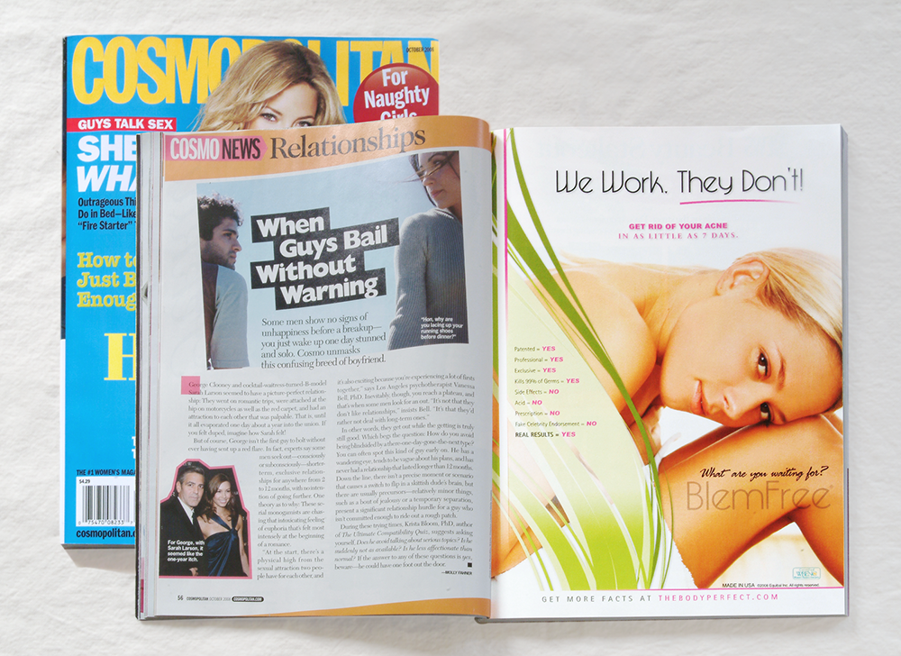
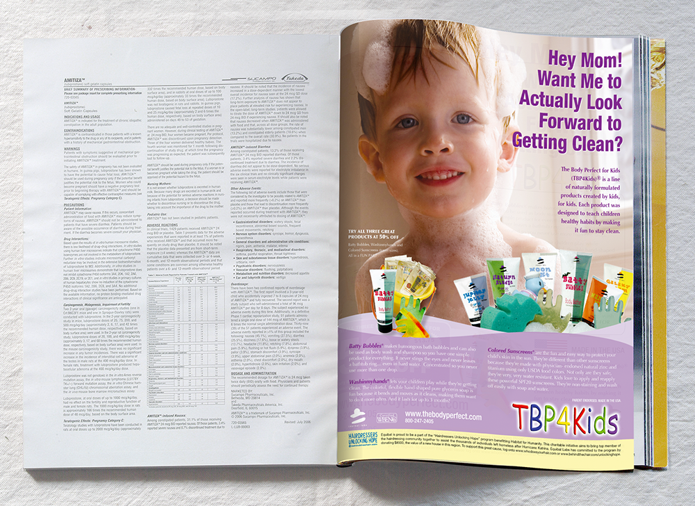
I worked in print advertising and design in New York and much of what was involved was collaborating on good copy, weaving in text and image. Advertising is terribly evil and manipulative. That probably sounds worse than I intend, but the creative work is satisfying, especially when you're able to see your efforts national magazines like Good Housekeeping, Redbook, and Cosmopolitan. The shop I worked with, Momentum, worked locally and nationally. It was loud and rambuctious. The boss was an all-around good guy. He was business-minded, didn't keep track of vacation days, and was always quick with a quip.
Me: “I was just thinki—”
Boss: “No, you weren’t.”

We made a lot of print ads, logos, typsos, websites, and print things for the national and regional beauty, healthcare, and financial industries. I left in 2009 to take up teaching full-time. First in New York SUNY, then Cal Poly Humboldt. These days, I am the program coordinator of the B.F.A. program at Oregon State University.